
Popular Green Paint Colors For The Home
Interior design trends in 2021 incorporate natural materials and color palettes rich in earth tones and natural colors as consumers are still craving the color green this year. Green perfectly captures our appreciation of nature’s ability to reinvigorate and calm. Inspired by the rolling countryside, lush fields of foliage and grassy plains, this hot hue gets us off our portable technology and social media and simply get back to nature.
The beauty of using green in interior design is its many tones and hues help you find the right shade to compliment every room in your home. Not sure what green will work in your home or where to use it? Check out these 8 fabulous shades that will make your neighbors green with envy – no pun intended!
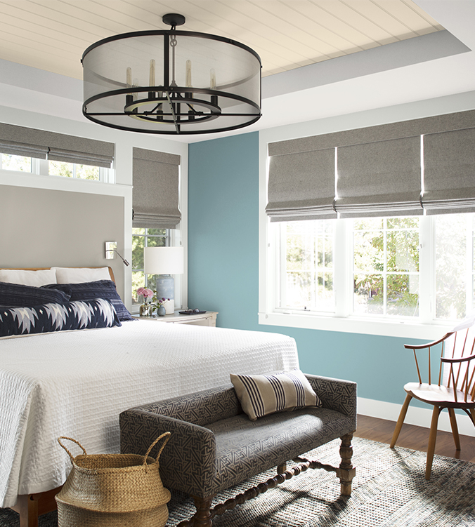
Image Credit: Benjamin Moore
Benjamin Moore | Aegean Teal
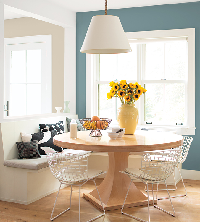
Image Credit: Benjamin Moore
The Benjamin Moore 2021 Color of Year balances blue and green with a gray undertone to create natural harmony. We find this color to be intriguing, balanced and deeply soothing as this green shade is an excellent addition to an organic palette. The shade adapts to multiple applications; use it to accent kitchen cabinets, brighten up a sitting area, or add contrast to furniture. Aegean Teal works well in kid’s rooms and bedrooms.
Farrow & Ball | Green Smoke
Image credit: Farrow & Ball
Move away from calming blue tones to create warmth with this hue of a smoky green with a touch of blue undertones. This paint color has an inviting deepness when used on the exterior while portraying a calm and serenity when used inside a home. It is featured as a color of the year in Farrow & Ball’s “Natural Greens” palette, the shade’s richness means it can enliven a room. If you have a space that uses a painted floor, such as an art studio, a gym, or a kitchen, try this green to add an anchor to space. It works equally well in a dining room or a living room.
Sherwin-Williams | Hazel
Image Credit: Sherwin-Williams
When you want to create a feeling of calm and tranquility, we highly suggest to try this soothing green tone that says coastal in our eyes. Its mix of blue and green tones speaks to a peaceful atmosphere. Try using it in a bedroom, nursery, or in a home office to promote feelings of tranquility as its light reflectant value is right at 50% which is a perfect balance of not too dark but not too light. The vibrant color makes a small space, such as a half-bathroom or den, appear larger and what a perfect color for a yoga/zen room!
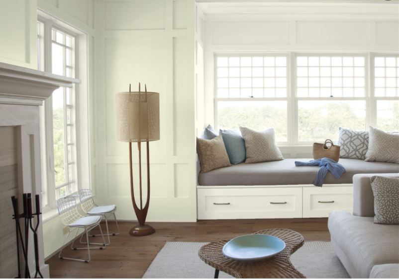
Image Credit: Benjamin-Moore
Benjamin Moore | Limesicle
Brighter green hues both energize and refresh a space. This Limesicle green is a perfect example of bright and refreshing color. Try it in an area with lots of light, such as a living room or in the kitchen. Add a touch of whimsy to furniture in a bedroom or a creative office. The green is versatile enough to pair with neutrals like beige and taupe, but it can also play well against darker jewel tones.
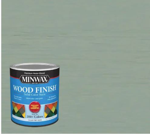
Vintage Blue | Minwax
Don’t let the name of this color fool you and this one is not for walls but if you are a DIY fanatic may be one for giving a piece of furniture new life. For its first 2021 color of the year, Minwax chose Vintage Blue, a mix of blue and green with soft gray undertones. Applied as a wood stain, the color is about comfort and calm while playing to our sense of nostalgia. Apply to cabinets, shelving, wood furniture, and other decorative accents. It pairs well with various design styles, from vintage-inspired, maximalist, to minimal with a pop of color.
Benjamin Moore | Avocado
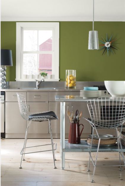
Image Credit: Benjamin Moore
Another benefit to selecting green for your interior design palette is its versatility with different design styles. This bold color from Benjamin Moore speaks to the mid-century vibe. Use it on mid-century modern furniture, or try it out in a kitchen for a throwback to the ’60s. It could also work well in a den or living room.
Valspar | Garden Flower
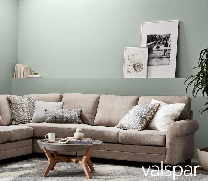
Image Credit: Valspar
Part of its 2021 Colors of the Year collection, Garden Flower is a soft pastel green with gray undertones that are reminiscent of succulents or spring garden. The mood here is calm and relaxation, making this color ideal for bathrooms, bedrooms, or subtle accents to neutrals. It’s the perfect shade if you’re looking for a natural and rustic interior design.
Image Credit: Benjamin Moore
Benjamin Moore | Mediterranean Teal
This color is claimed to be one of the worlds best color according to top interior designers as they claim its THE perfect mix of green and blue and a dash of gray tones to make it muted and upscale for those with caviar tastes. Add some of this bluish tones to your green to get a retro yet elegant color. This tone is recommended for kitchen cabinets or painting furniture. The rich teal is almost a deep jewel tone, making it ideal for a luxurious accent to any space.
What to Pair with Green
Green is a versatile color with many hues, from the more neutral to the rich, invigorating jewel tones. With blue, gray, or yellow undertones, you can find the right fit for any room.
The best pairings for green depending on the color’s specific hue, tone, and color use. Generally speaking, off-whites, neutral beiges, and grays complement well. For accents against green, common choices are black, pink, and white. Green naturally goes well with sustainable materials such as wood, stone, and brick.
Green easily works in a warm or cool color palette. Warmer greens are complemented by red and orange hues. A cool color palette will see a mix of gray, blues, and whites.
Where to Paint Green
Use green as the primary color or to accent spaces or furniture. Green goes as well on kitchen cabinets as it does on floors and walls. It’s all about picking the right shade of green to reflect the mood and architecture of the room.
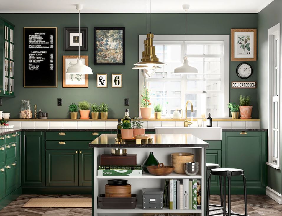
Image Credit: IKEA
To invigorate spaces, work with deep jewel-toned greens or bright hues with a warm undertone painted on walls. For a more relaxing feeling, choose softer shades with cool undertones or a touch of blue.
For a mid-century or retro feel, incorporate green into your accent pieces or furniture.
Choosing Green for your Home
This color of renewal is perfect for the current times. Green shades work to energize or ground a room. Experiment with these green paint colors and any room in your house to complement your interior design.


Your comment on Benjamin Moore Limesicle is so helpful and encouraging! Choosing the right color is becoming a dilemma for me. My west-facing kitchen (Ontario, Canada) has lots of light and is currently painted with an off-white similar to Linen White or Navajo White. We like those colors, but choosing one of them would mean more of the same. Limesicle could be a good choice to bring change.