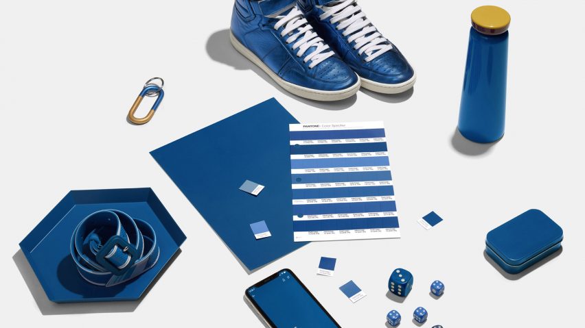
Why Classic Blue is Pantone’s 2020 Color of the Year
Every year, the Pantone Color Institute releases its annual Color of the Year. And this year, the 2020 Color of the Year is… Classic Blue!
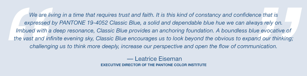
According to Leatrice Eiserman, Executive Director of the Pantone Color Institute, Classic Blue “is a solid and dependable blue hue that we can always rely on. We are living in a time that requires trust and faith. It is this kind of constancy and confidence that is expressed by PANTONE 19-4052 Classic Blue”.
 Classic Blue symbolizes relaxation, calmness, and confidence. It’s a color that exudes elegance, dependability, and connection. In general, the psychology behind the color blue has long been associated with stability and depth. It conveys a sense of trust and serene calmness, which is why a lot of people consider it their favorite color.
In today’s world, it’s good to have a sense of stability and Classic Blue is able to offer that through color.
Not only has the Pantone Institute selected a blue hue as their Color of the Year, but Sherwin Williams’ 2020 Color of the Year is also a shade of blue. The Sherwin Williams Color of the Year is Naval, a darker shade of blue that borders “on the horizon between ocean and evening sky”. It seems that Navy is coming out of its comfort zone and we find that 2020 is going to be an empowering year of change that focuses on bringing your best self into the new decade. The next 10 years pave the way for the wellness of the mind, body, and soul – a clean palette for self-nurturance.
How to Decorate with Classic Blue
Over the past few years, we’ve seen more homeowners start to decorate with the color blue. From dining rooms to kitchen cabinets, blue is becoming more than just an accent color.
With Classic Blue as the 2020 Color of the Year, we’re excited to share a few ways you can use the color in your existing decor:
Color Palettes:
Color palettes are artfully crafted color schemes that show you what colors go together when decorating your home or creating anything that uses color (crafts, flower arrangements, etc.).
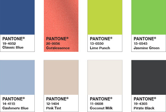
 One of the first color palettes using Classic Blue is Ponder (to the left). This palette uses soothing blues and more earth tones to create a calming, tranquil, and peaceful feeling.
Depending on the way you use these colors, whether you use more of the blues or tans, you’ll be able to create varying levels of tranquility throughout your space.
Another color palette is Snorkel (to the right). Snorkel is a bolder palette, however, still leverages Classic Blue to bring in the calming effect.
These colors are playful and enchanting, reminiscent of a tropical paradise. Using black, white, and the Classic Blue adds additional strength and depth to the color combination.
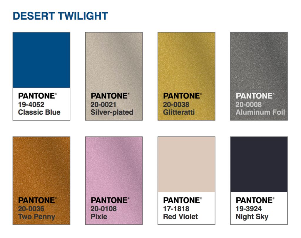 Desert Twilight (left) is by far our favorite color palette using Classic Blue. This glittery combination reminds us of the evening sky in the desert, where the various shades all come together as the sun is setting.
Home Decor:
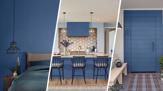
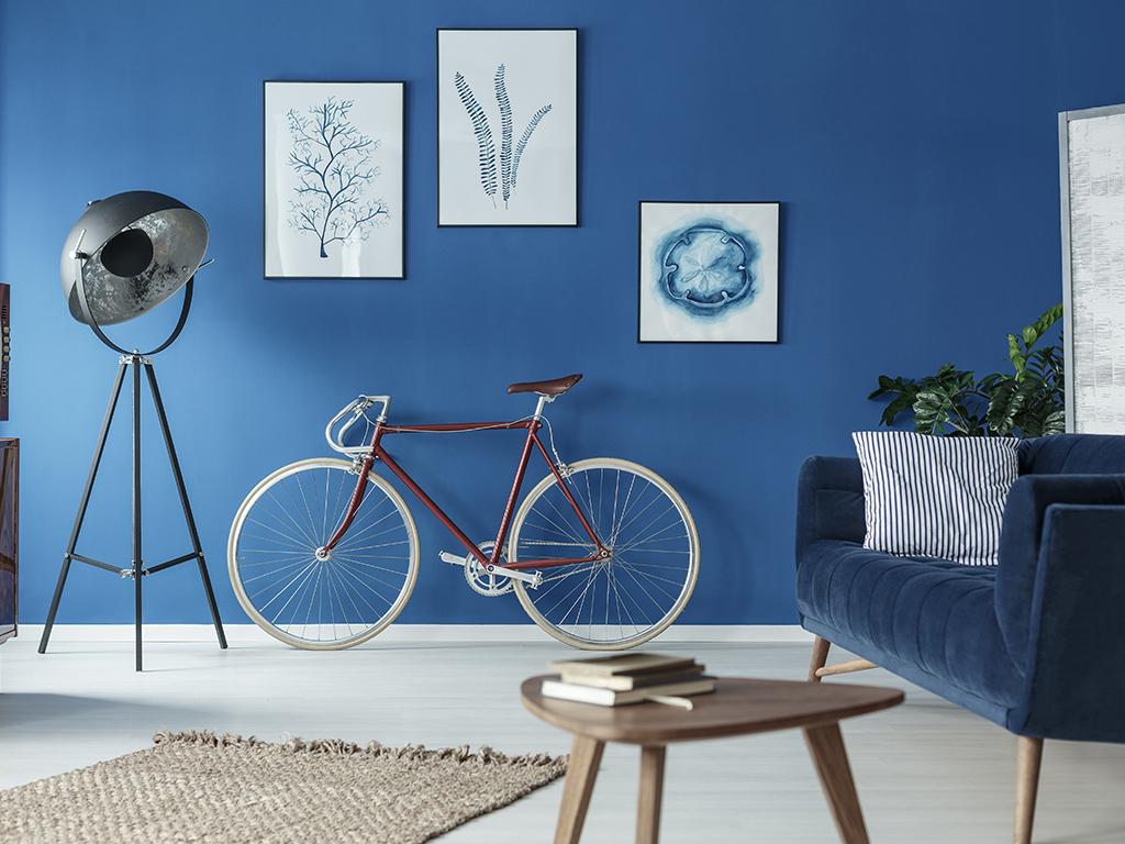
When it comes to home decor, you have lots of options to bring Classic Blue into your home. You can use the color as the base of your room, like your wall paint color, or as an accent color using flowers, furniture, and vases.
 Classic blue brings a sense of creativity and confidence in the interior of your home. Friends and family will feel serene as they’re in your home, seeing this gorgeous color gracing either the walls or fabrics in your living room or dining room.
If you want to bring a sense of calmness and relaxation to your bedroom, Classic Blue just might be the perfect wall color. If you think it might be a tad bit too dark, you could also leverage the color in your comforter, accent pillows, and knick-knacks. This will bring the aura of stability to your room, allowing you to rejuvenate and relax at the end of every day.
You could do the very same in your master bathroom too, creating a spa-like atmosphere that invites relaxation and rejuvenation after a long, hard day. Using towels, flowers, and bath salts, lotions, and bubble bath, you could bring tranquility into your bathroom and your life.
About Pantone’s Color of the Year
For more than two decades, the Pantone Color Institute has picked a Color of the Year. This color is inspired and influenced by travel, fashion, and culture. The selection process is rigorous, with the Pantone Color Institute looking to the world for both color and name inspiration.
“The Pantone Color of the Year highlights the relationship between trends in color and what is taking place in our global culture at a moment in time, a color that reflects what individuals feel they need that color can hope to answer,” added Laurie Pressman, Vice President of the Pantone Color Institute. “As society continues to recognize color as a critical form of communication, and a way to express and affect ideas and emotions, designers and brands should feel inspired to use color to engage and connect. The Pantone Color of the Year selection provides strategic direction for the world of trend and design, reflecting the Pantone Color Institute’s year-round work doing the same for designers and brands.”
The Last 10 Pantone Colors of the Year
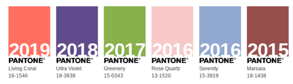

- 2009 – Mimosa
- 2010- Turquoise
- 2011 – Honeysuckle
- 2012 – Tangerine Tango
- 2013 – Emerald
- 2014 – Radiant Orchid
- 2015 – Marsala
- 2016 – Rose Quartz
- 2017 – Greenery
- 2018 – Ultra Violet
- 2019 – Living Coral