When you designed your home, you created spaces that are both deeply personal and specifically suited to your family’s tastes and needs. From your aqua and red retro kitchen to your pale purple bathroom, your home has your name written all over it. But now that it’s time to sell your home, your personal style may turn off potential buyers. Here are some tips for staging your home in a way that buyers will love!

Colors and Styles That Keep Your Home from Selling
While many realtors tell their clients, “Paint can be changed,” or “See beyond the wallpaper,” the truth is, today’s buyer doesn’t want to move in and start scraping wallpaper or painting entire rooms. Millennial home buyers are looking for turn-key homes where they can move in and start living their lives. This means that before staging or selling your home, the overly personal or outdated colors and styles that mean so much to you need to be removed to make way for fresh, neutral colors and styles that will appeal to home buyers.
Wallpaper is a serious drawback both because it is so personalized and specific, and because it is time-consuming and difficult to remove. However, overly bold paint colors such as red, purple, or pinks, can be just as damaging to a home’s sales chances. Swapping these styles for fresh, clean paint can lead to a much better selling price for just a little bit of money!

Create a Beautiful Backdrop
Staging a property involves adding beautiful furnishings and décor items that show the property to its best advantage. It allows buyers to see the proportions of the area and the best uses of space, while not being so personalized as to block a buyer from envisioning him- or herself from living there.
To ensure the home staging is most effective, you need to create a beautiful backdrop, first. Instead of limiting your staging options to try and match red walls or not clash with floral wallpaper, consider shades that are both neutral and lovely, such as grays, taupe, and greige. This way the staging company has broader options available as far as furnishings and décor and can truly select pieces that will create that “Wow!” factor that buyers desire.
Working With Your Open Floor Plan
Open floor plans are highly sought after features in today’s market. Having a beautiful, neutral paint color throughout the home will make the space feel larger, airy, and stylish. While many homeowners are afraid of using a neutral in an entire area for fear of being boring, that is far from the case. With a single neutral paint through the open areas, you are creating a connection throughout the home while opening up the space even more.
With the neutral paint in place, selecting a secondary color in each space will create clarity of usage. For example, with a pale shade of gray throughout, the living and conversation area can be highlighted with shades of deep blue, while the kitchen can be livened up with bright pops of yellow.
Our Favorite Neutral Paint Colors for Staging
Here at No Vacancy, there are several neutral paint colors that we are absolutely in love with! However, more important than our opinions, buyers and sellers alike fall in love with these sophisticated shades. Courtesy of Sherwin-Williams, try these 7 Home Staging Paint Colors that will create the neutral backdrop that buyers will love!
- Alabaster (SW 7008) – A warm, soft white that is still clean and crisp!
- White Hyacinth (SW 0046) – A rich, pale shade that is perfect for both modern and traditional décor!
- Nomadic Desert (SW 6107) – A warm, deep beige
- Perfect Greige (SW 6073) – One of the most popular shades for a reason, this is a perfect blend of beige and gray that is sophisticated and comforting.
- Agreeable Gray (SW 7029) – A ‘warm’ gray that has just a hint of a beige undertone!
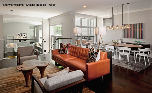
- Knitting Needles (SW 7672) – A clean, pure gray that works with any style and in nearly any room!
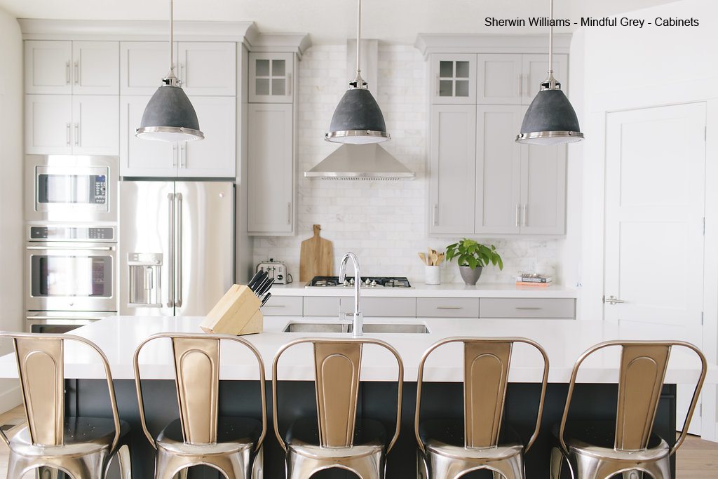
- Mindful Gray (SW 7016) – A popular, warm shade of gray that makes a lovely contrast color and main wall shade!


[…] backdrop for the greenery, wood, and earthy elements you’re bringing in to the spaces. Some of our favorite paint colors are perfect for a naturally staged […]