
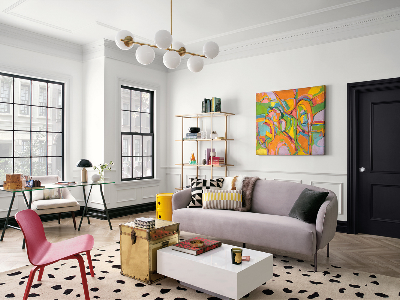
When decorating your home, you spend a lot of time selecting and investing in the right artwork to go on the right walls in your living spaces that add that special touch. Not only do you spend time choosing the perfect piece of art but you put a lot of thought into placing it in the right frame to give the piece a finished and attractive look that you will enjoy looking at but also may start a conversation in a room.
Sherwin-Williams Elation wall color.
It all sounds like the perfect addition when decorating your home but did you know that the wall color behind that beautiful piece of artwork should also be a factor that you consider?
Museums, like the Metropolitan Museum of Art in New York City (also known as The Met), often bring in color consultants to help them create compelling wall spaces to display the priceless pieces that are hung in this prestigious museum. According to Donald Kaufman, a color consultant who has worked with the Met, “the color you paint your wall is as important as the frame you select.”
Hanging art is definitely the easy part but the color that goes behind it can be tricky.
5 Tips for Picking the Right Backdrop for Your Artwork
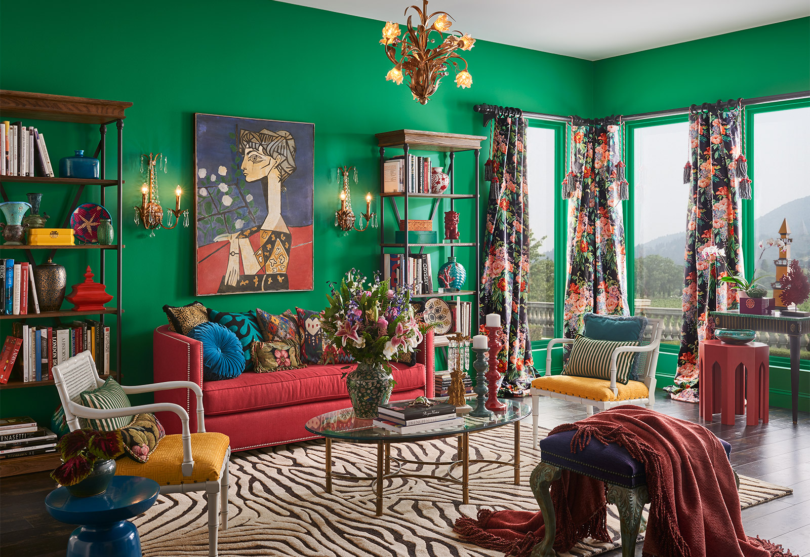
Sherwin-Williams Argyle wall color
1 – Choosing the Right Wall Color
The wall color behind your piece of art is just as important as the color of the frame. When the right wall color is chosen, the wall will seemingly fade away, leaving only the person and the artwork.
So how do you go about picking the right color for your backdrop?
2 – Observe Surroundings and Architectural Details in a Room
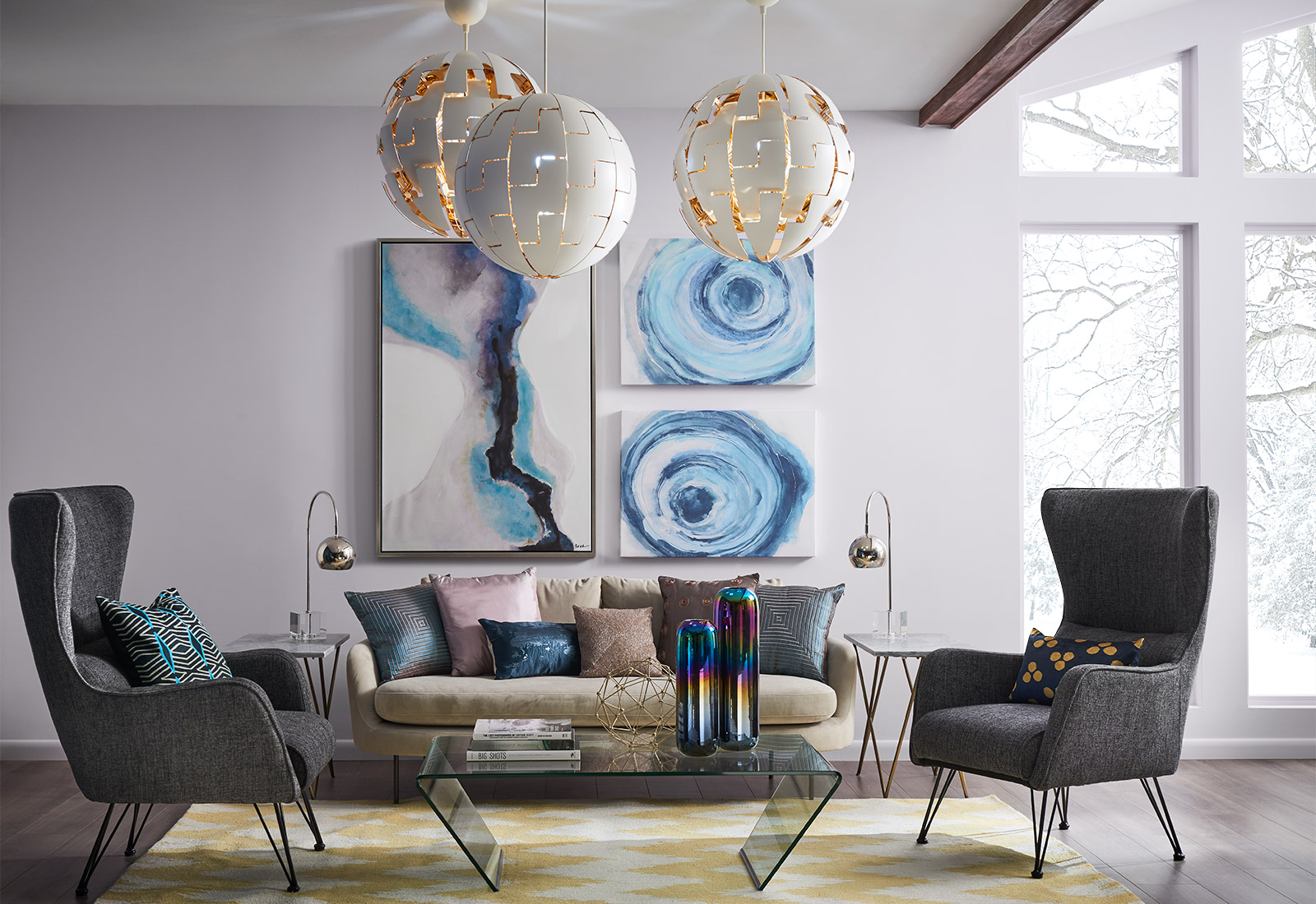
Sherwin-Williams Misty wall color.
- Are there any architectural details? Wainscoting, intricate archways, dental crown molding, and other similar details can play a factor into the wall color.
- Is there a lot of natural light in the room? Natural light can change the way color is perceived in a room. Even the time of day the natural light is hitting a room can affect the color. Check the light at various times throughout the day to see the variations in light and how your wall color might be affected.
- What is the flooring like? Not only does natural light change a room, flooring can too. Make sure to see what your flooring looks like in the morning, afternoon, and early evening to get a good gauge of what sunlight/light looks like in the room.
3 – Think in Color NOT Intensity
Thinking of the right paint color for a room can be challenging. Instead of trying to choose a specific color though, consider thinking about the intensity.
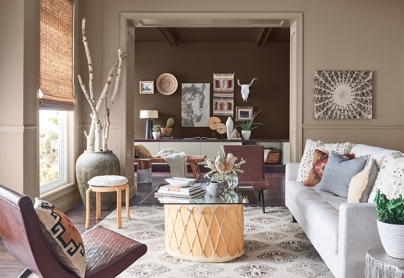
Sherwin-Williams Moth Wing front wall color and Dark Clove back wall color.
Do you want a warm tone, a neutral color, or a cool palette? If you shift to looking at color this way, you can more easily pair colors in the same family together. For instance, if your room doesn’t get a lot of natural light and the floors are a cool hardwood stain, you should probably opt for cooler paint colors.
By thinking in intensity, you get away from saying I want red or green or blue. Immediately choosing a specific color can almost make you feel locked in to that shade and prevent you from trying other colors in the room. Plus, there are so many shades of red, green, and blue that by selecting an intensity first, you’re able to choose a red, green, or blue hue that fits exactly.

Sherwin-Williams Charcoal Blue wall color.
Another color tip: Don’t match your wall color to the art piece. Your background color should support your artwork, not blend into it. If your artwork is blue, don’t choose a blue wall color. Instead choose something that will complement blue, like beige, grey, or eggshell.
4 – Select the Right Paint Finish
If you’re a first-time painter, one thing you have to know is that there are several types of paint finishes. Some finishes are used in particular areas of the house for a reason (semi-gloss in kitchens so you can wipe down the walls without messing up the paint) while others boil down to personal preference.
When considering the paint color to go behind the artwork, you also want to keep in mind the type of finish you want to have. Each finish can affect how the artwork will look and feel against the wall.
There are several types of paint finishes:
- Flat – Also called matte, flat paint is a non-reflective paint that soaks up any light directed at it. Flat paint is usually pretty easy to apply, too.
- Eggshell – Eggshell is a durable paint that is typically used in living rooms and dining rooms. This type of paint finish does not pick up dirt easily.
- Glossy – Glossy paint is shiny and can have a mirror-like effect (reflecting light)
- Satin – Satin paint is a durable paint that has some sheen to it.
- Semi-gloss – Semi-gloss paint is also a durable paint finish and can be wiped/scrubbed down due to its gloss level. This paint finish is popular in kitchens and bathrooms.
Which is best? All depends on your artwork. Mr. Kaufman says the finishes he prefers “best are the flattest flat and the highest gloss.” He also states that flat paint is easier to touch up, so if you plan to move your artwork around then a flat finish might be best for your room.
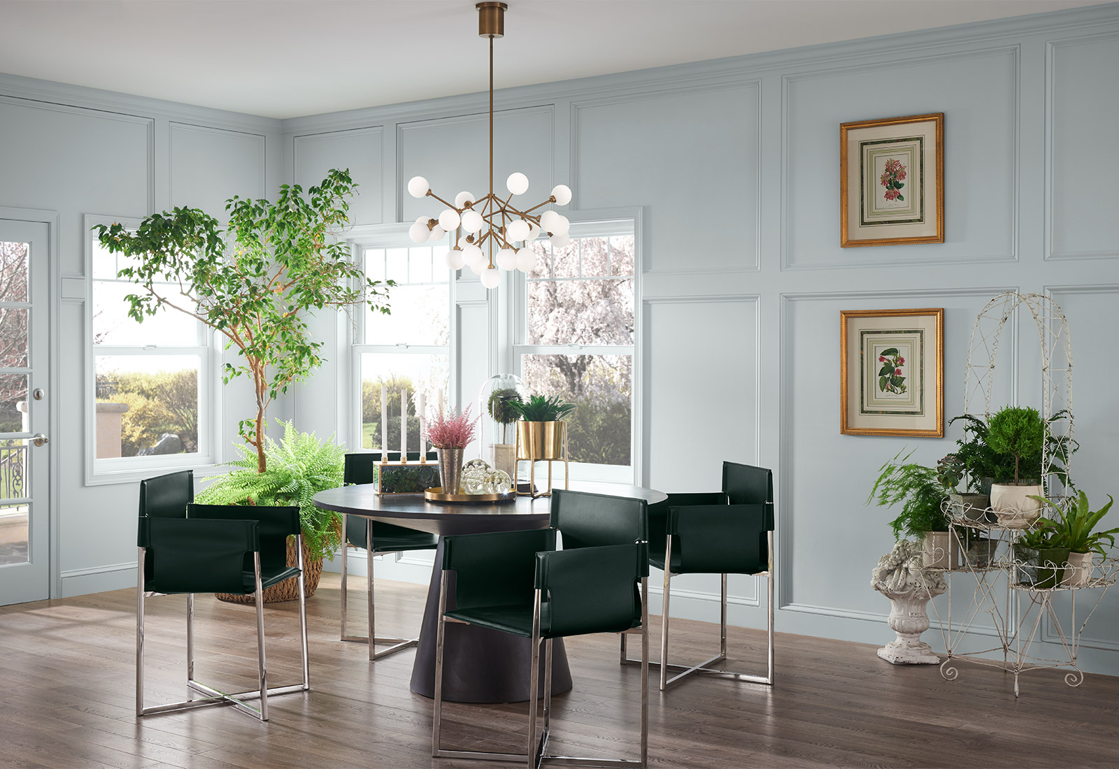
Sherwin-Williams Pure White wall color.
5 – Keep it Simple
For some, the thought of choosing a wall color is just too much. Just the thought of a color period can be overwhelming. If that’s the case, there is nothing wrong with keeping the paint color simple: white, grey, and beige are perfectly good neutral hues that can adapt to their surroundings.
It might be especially helpful to go this route if you’re unsure if the artwork is the right fit for the room, you’re not done decorating the room, or you’re indecisive about a complementary hue.
The Perfect Backdrop Does Exist
Finding the right paint color might take a bit of experimentation. You might try a few warm shades of grey before settling on the perfect hue, but it will be worth it when your artwork shines against your newly painted wall.